- Previous message: Rick McGowan: "Unicode.org server move this week"
- In reply to: Karl Pentzlin: "Character Identity and Font Selection"
- Next in thread: James Cloos: "Re: Character Identity and Font Selection"
- Reply: James Cloos: "Re: Character Identity and Font Selection"
- Reply: Marion Gunn: "Re: Character Identity and Font Selection"
- Reply: Jukka K. Korpela: "Re: Character Identity and Font Selection"
- Messages sorted by: [ date ] [ thread ] [ subject ] [ author ] [ attachment ]
- Mail actions: [ respond to this message ] [ mail a new topic ]
Hello,
am 2011-06-07 12:34, schrieb Karl Pentzlin:
>a character, once selected, has to be displayed as the
> "correct" character in all situations as long as the used font contains it
> at all.
> Otherwise, the character has a "multiple identity", which indicates an
> erroneous unification of different abstract characters into a single
> Unicode point.
In this context, two issues come to mind:
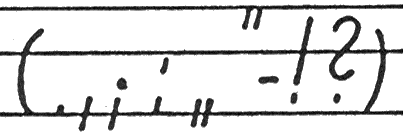
• The left, American style, quotation mark, and the right, German style,
quotation mark are unified in *U+201C*. While this works quite well
with the curly glyphs present in most Roman style fonts; however,
it fails blatantly whenever the quotation marks are designed as
oblique strokes, e.g., in the Palatino Linotype, Courier New, and
Comic Sans MS fonts: the left, American style, quotation mark is
slanted from top left to bottom right, whilst the right, German
style, quotation mark is slanted from top right to bottom left
(cf. the attached specimen for German school-beginners).
• Many IPA symbols are unified with small Latin, or Greek, letters,
e. g., the IPA Open Front Unrounded Vowel, and the Latin Small
Letter A are unified as *U+0061*. As the Latin Small Letter A
covers a wide range of glyph designs, including some like the
IPA Open *Back* Unrounded Vowel (e. g. in the Comic Sans MS font),
you may get the wrong glyph (belonging to some other character!)
if you display IPA data in a font not designed for IPA.
I am not sure what should be done about these issues.
I guess it is too late now to dis-unify the two quotation marks
discussed supra. However, the Unicode standard should explicitely
discuss that problem, in the following places:
• Perhaps via an additional example in chapter 6, section “Rendering”,
• definitely in chapter 6, section “Paired Punctuation”, subsection
“Quotation Marks and Brackets”,
• in the code-charts, a pertinent note on U+201C would be helpful.
Eventally, fonts having oblique-stroke shaped quotation marks should
provide two glyphs for U+201C; rendering software should be able to
choose the correct glyph, based on data about the language of the
text to be rendered; and text-processing software should provide such
data to the rendering software.
Probably, IPA data is not so abundand as German, Czeck an Slovak text
data, by now; hence a dis-unification of the IPA characters from
their Latin look-alikes may still be feasable – I cannot asses the
feasability, though. If IPA characters cannot be dis-unified from
Latin, and Greek, characters, eventually the text-processing, and
the rendering, software should solve the problem via language data,
as outlined above; i. e., IPA should be handled as a ‘language’,
in its own right.
Best wishes,
Otto Stolz
- Next message: James Cloos: "Re: Character Identity and Font Selection"
- Previous message: Rick McGowan: "Unicode.org server move this week"
- In reply to: Karl Pentzlin: "Character Identity and Font Selection"
- Next in thread: James Cloos: "Re: Character Identity and Font Selection"
- Reply: James Cloos: "Re: Character Identity and Font Selection"
- Reply: Marion Gunn: "Re: Character Identity and Font Selection"
- Reply: Jukka K. Korpela: "Re: Character Identity and Font Selection"
- Messages sorted by: [ date ] [ thread ] [ subject ] [ author ] [ attachment ]
- Mail actions: [ respond to this message ] [ mail a new topic ]
This archive was generated by hypermail 2.1.5 : Wed Jun 08 2011 - 06:27:07 CDT